A brand guide is a set of standards that defines how a company’s brand should be used. It typically includes the company’s logo, colors, and other visual elements. But it can also include things like the company’s mission statement, tone of voice, and even the type of paper that should be used for print materials. It’s an invaluable tool for maintaining a consistent brand identity across all channels and ensures that every touchpoint reflects the company in the best possible light and reinforces the message that the company is trying to communicate.
The components of an essential branding guide:
- Cover
- Welcome Page
- Logo Variation
- Logo Usage
- Social Media Avatars and Favicons
- Color Values
- Typography (Font Usage)
Let’s look at a recent example for one of our favorite clients, a chocolate producer in Vero Beach, FL.
The cover is designed to reflect the brand instantly and set the tone.
A welcome page explains quickly and concisely what this guide’s intention and purpose are.
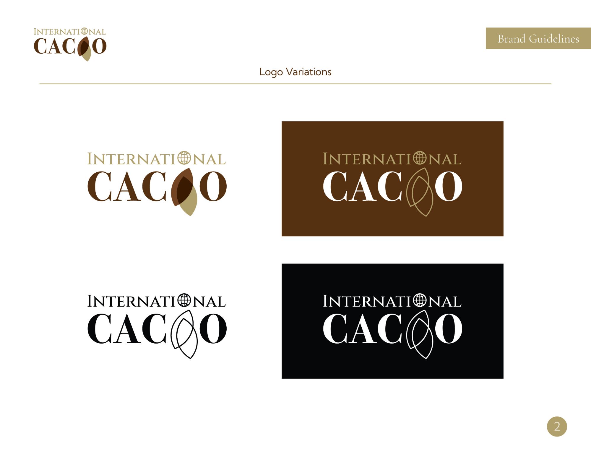
A logo variations page illustrates how the logo should appear in a different version, including full color, full color reversed on dark, black & white, and black & white reversed (all white logo).
![]()
It’s essential to maintain the integrity of a brand logo. A logo variations page illustrates what not to do to avoid disturbing that integrity. This page instructs the reader not to rescale individual components, realign, re-typeset, distort, recolor, or rotate the logo.
![]()
A social media avatars & favicons page illustrates how the logos and icons should be used in instances where they find themselves being cropped into a small circle or, in some instances and, a small square. When cropped into a circle, a logo needs padding and breathing room, so it doesn’t get clipped outside the edges.
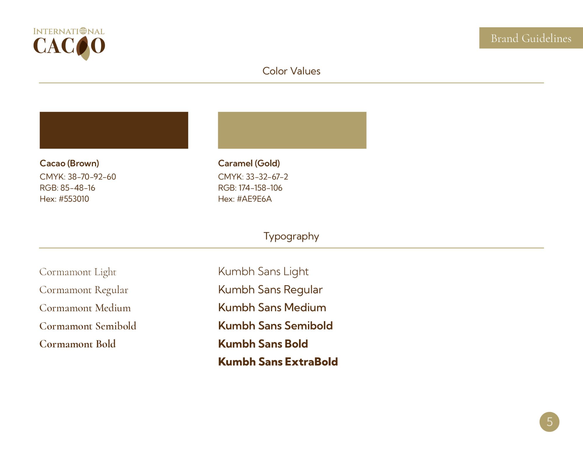
A color values section specifies colors to use for the brand and provides values in CMYK, RGB, HEX, and Pantone colors in some instances when used for high-end printing. Using these color values ensures printed materials are consistent and the brand is accurately represented. The typography section identifies the fonts used for a brand identity and displays the fonts in different weights, sizes, and use cases.
For small businesses, a well-designed brand guide can distinguish between appearing professional and looking like a fly-by-night operation. For larger companies, it’s essential to maintain control over how the company is represented to the world. Either way, a brand guide is an essential part of any business’s marketing strategy.